
Photo by Cody Davis on Unsplash
What is the Kano model?
The Kano model is a standardized method of finding out how features of a product or service are perceived by customers. It's an easy way of prioritizing a roadmap and improving customer satisfaction.
Why use it?
It's really helpful if you
- don't know what features to invest time & money in;
- have a lot of internal discussions about what your product roadmap should be;
- want to know what will separate you from your competition (as seen from the customer's perspective).
How does it work?
The survey format
The way you find out about customer sentiments is with a standardized survey format. Basically, you present the feature and ask how the customer feels if the feature is there and how she feels if the feature is not there. Each time, the answer is one of:
I like it
I expect it
I don't care
I can tolerate it
I dislike it
The categories
The Kano method provides a way of analyzing your survey data and categorizes your features in one of the following categories:
- Must-be: your product or service will not be used by the (prospective) customer if it doesn't have this feature. Silly example: a steering wheel on a car
- Performance: a feature in this category is seen as better the more there is of it; E.g. mileage in a car. The higher the mileage, the more satisfied the customer
- Attractive: these kinds of features are the unexpected delighters. Your car telling you the nearest and cheapest parking space could be such a feature
- Indifferent: people don't care about these. Could be for example the number of cylinders the motor has.
- Reverse: customers dislike this feature. Could for instance be the car horn playing La Cucaracha.
There's one more category: "Questionable". That one means the answer was contradictory (e.g. a user saying she likes the feature's presence but also likes its absence).
Assigning categories
The categorization of your survey results can basically be done in two different ways: discrete (easy) and continuous (more insights, a little bit more difficult).
Discrete analysis
The fastest and easiest way is the discrete categorization, where each answer is assigned a category based on this table:
To get a rough idea of how customers perceive your product features, simply add up the categories for each feature based on the answers you received. The feature gets assigned the category with the most answers.
| Feature | Must-Be | Performance | Attractive | Indifferent | Reverse | Questionable | Final category |
|---|---|---|---|---|---|---|---|
| The car horn plays La Cucaracha | 1 | 0 | 0 | 0 | 15 | 0 | R |
| Mileage is ca. 1000 km | 5 | 10 | 1 | 0 | 0 | 0 | P |
| The car shows you the nearest parking spot | 2 | 3 | 9 | 2 | 0 | 0 | A |
Continuous analysis
Here at Kanochart, we use continuous analysis, meaning use the averages (means) of the answers' satisfaction potential to categorize the features. The satisfaction potential is a term coined by the researcher Bill Dumouchel. For each answer, the satisfaction potential is:
| I like it | I expect it | I don't care | I can tolerate it | I dislike it | |
|---|---|---|---|---|---|
| Feature is present | 4 | 2 | 0 | -1 | -2 |
| Feature is absent | -2 | -1 | 0 | 2 | 4 |
As you can see, there is more weight attached to positive sentiments. In other words, the more a feature's presence is liked and the less its absence is liked, the higher the feature's satisfaction potential.
With this method, the average satisfaction potentials of each feature determines the final category. The Dumouchel method favours strong sentiments, meaning features that on average get between 0 and 4 for both presence (i.e. answers between not caring and liking presence) and absence (i.e. answers between not caring and disliking absence) of the feature.
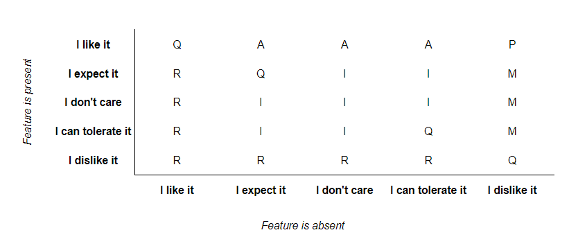
How features are categorized is based on this table:
| ⬇Presence/Absence➡ | Like - Expect | Expect - Don't Care | Don't Care - Tolerate | Tolerate - Dislike |
|---|---|---|---|---|
| Like - Expect | Q | A | A | P |
| Expect - Don't care | R | I | I | M |
| Don't Care - Tolerate | R | I | I | M |
| Tolerate - Dislike | R | R | R | Q |
So, a feature where the average satisfaction potential for its presence is 3.2 (meaning most people like or expect it to be there) and for its absence is 1.1 (meaning the average sentiment is between tolerating and don't caring about its absence) falls into the Attractive category. That makes perfect sense, doesn't it?
As you notice, this kind of analysis is a little bit more difficult to carry out, and that's exactly why this website was built. The continuous Kano analysis is at the basis of our Kano reports and analyses.
How can I build a product roadmap out of this analysis?
After having done the analysis, you basically have your roadmap spelled out for you:
- First, you must implement all the "Must-be"-features, otherwise customers will be very dissatisfied;
- Then, the "Performance"-features. You don't have to do all of them, businesses typically decide based on the effort required & expected value of a feature. But don't forget to take into account the importance your customers attach to the feature;
- Same goes for the "Attract" features;
- And of course you shouldn't spend any time on the "Indifferent" features.
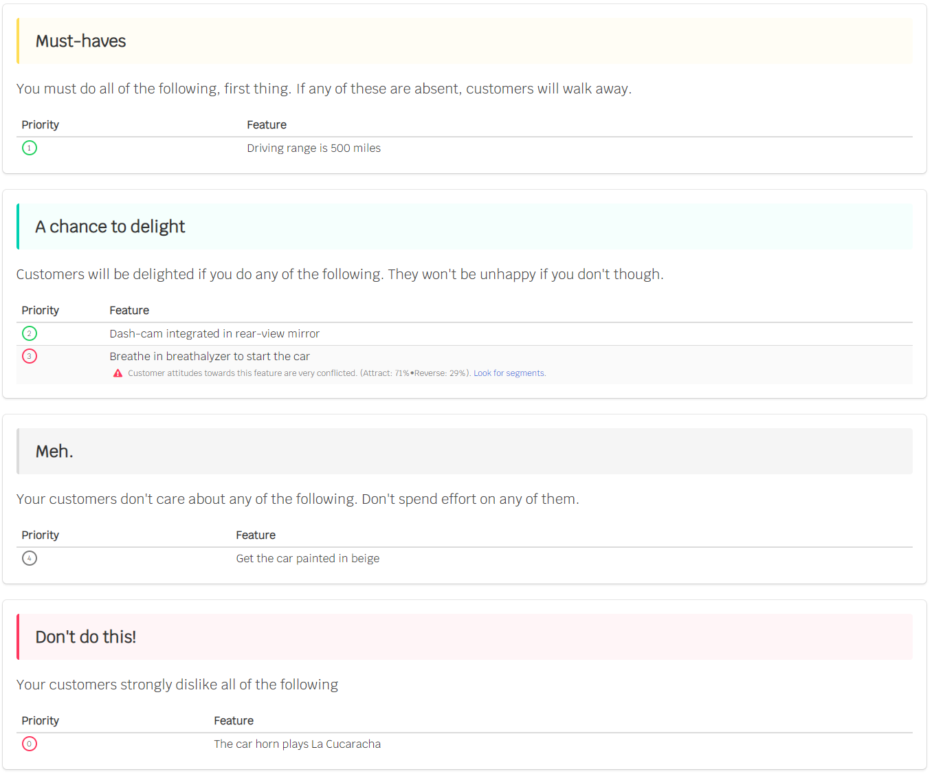
The reports you get at Kanochart look like this:
Is that all?
No.
It's not always as clear-cut as I made it out to be. Now that you know a little bit about how it works, you're ready to go down the rabbit hole.
For instance:
- What about changing customer expectations?
- Or what to do about indecisive results?
- Are "Indifferent" features really to be disregarded? (Certainly not!)
I'm currently writing a complete guide to the Kano model in public. You can also follow along via @kanochart on Twitter or by subscribing: